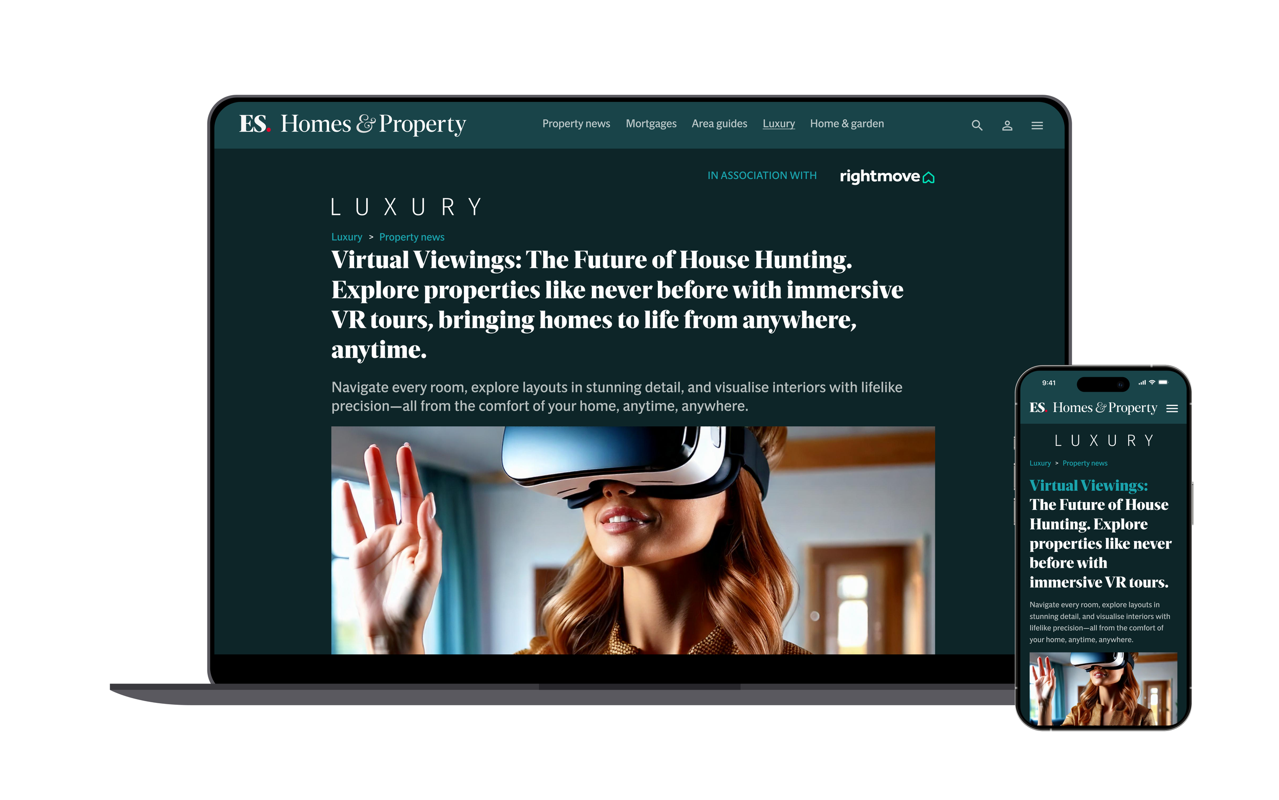
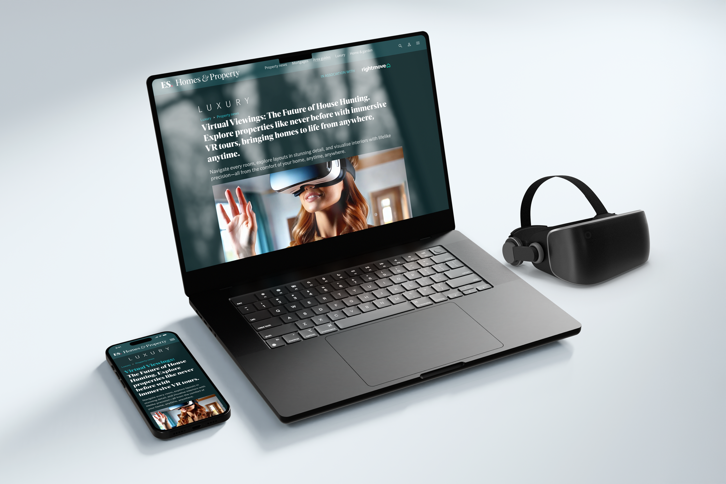
Optimising and transforming ES Homes & Property Luxury (CX)
CLIENT
Homes and Property Luxury
Homes and Property Luxury is a high-end property platform under the Evening Standard. Homes & Property is a key player in the UK real estate media landscape, providing property news, market insights, and listings. In collaboration with Rightmove, the platform connects home buyers with real estate opportunities.
INFO
Team
Lead Product Designer
Product Manager
Customer Relationship Manager
Engineers
Role
AI Design Consultant - Research & Insight - User Experience Design - User Interface Design
Dates
20 Weeks
OVERVIEW
Problem
The Homes & Property website, particularly the Luxury section, lacked a seamless user experience, with outdated Area Guides and limited interactive features. Users struggled to engage with the content, and property listings lacked immersive exploration options. Additionally, the site’s navigation was not optimised for modern browsing habits, leading to high bounce rates and lower user retention.
Outcome
The redesign enhances the overall UX by optimising Area Guides and introducing VR property viewing experiences. These improvements ensure a more engaging and intuitive interface, increasing user engagement and boosting conversion rates for property listings.
Fewer Payment Failures – Wallet integration and clearer flows decreased failed charging sessions by 25%, easing frustration.
Business Efficiency Gains – Reduced support queries lowered operational costs by an estimated 15%, while increasing customer retention.
Key Achievements
Higher User Satisfaction – Post-redesign surveys indicated a +35% increase in satisfaction with app usability and trust.
Improved Charger Discoverability – Streamlined map flows reduced the average time to find a charger by 40%.
THE PROCESS
I conducted a 5-day design sprint based on the design thinking methodology that includes 5 stages:
Empathise
Audited Homes & Property flows, interviewed readers and property seekers, and ran stakeholder workshops with editorial and commercial teams. Key frustration: users loved articles but rarely converted into active property searchers.
Define
Framed the problem into two core goals: modernise the Area Guides as a discovery-to-listing engine, and introduce immersive, modern viewing tools to strengthen engagement and trust in property listings.
Ideation
Sketches explored IA simplification, interactive map-based Area Guides, and VR integrations for high-value listings. Competitor scans (Zoopla, Airbnb, Foxtons) showed opportunity to bridge lifestyle content and live listings.
Prototype & Test
Built mid-fi prototypes of Area Guide flows and VR property cards. Ran usability tests (n=18 Maze tasks + 6 moderated sessions). Iterated navigation, filter placement, and VR entry points to improve clarity and discoverability.
CLIENT BRIEF
Understanding the
Problem Space
The Homes & Property website faced challenges with cluttered and outdated navigation, making it difficult for users to explore listings effectively. Additionally, the Area Guides lacked regularly updated content, diminishing their usefulness for property seekers. Furthermore, the absence of an immersive property viewing experience hindered users from gaining a comprehensive understanding of potential homes before scheduling physical visits.
✅ What is working?
Strong reputation in the property sector.
Established partnership with Rightmove.
A well-known editorial voice.
❌ What is not working?
Low user engagement due to static content.
Inefficient property discovery process.
Lack of interactive features.
⚡️ What could be enhanced
Streamlined user journey with improved navigation.
VR-powered virtual property viewings.
Richer, more interactive Area Guides.
RESEARCH & INSIGHTS
Research showed outdated Area Guides, clunky filters, and static listings.
User journeys revealed two personas struggling to move from content to search. These insights shaped the case for modern guides and immersive VR viewings.
-
I carried out a detailed audit of the current Homes & Property site, reviewing navigation, search, and property listing templates. This helped me pinpoint usability gaps such as buried filters, static Area Guides, and weak mobile-first flows
-
I compared key players like Zoopla, Rightmove, Foxtons, and Airbnb. This analysis highlighted best practices in filtering, immersive media, and map/list parity, while also showing a gap for editorial-driven discovery that H&P could own.
-
I analysed GA4 and Looker dashboards to understand where users were dropping off. High bounce rates on mobile and low editorial-to-listing click-through confirmed the need for a stronger bridge between content and property search.
-
I collaborated with editorial and commercial teams to uncover internal challenges, such as outdated Area Guides and inconsistent taxonomy. These conversations also aligned the project goals across content, advertising, and UX.
-
I spoke directly to property seekers and lifestyle readers, mapping their end-to-end journeys. This revealed two personas: the inspired browser (starting in editorial) and the goal-driven seeker (focused on listings), both struggling to transition smoothly between content and search.
-
To validate navigation improvements, I ran card-sorting exercises and tested revised information architecture. This confirmed the need for clear, top-level entry points like Buy / Rent / New Homes, making it easier for users to start their journey.
Interconnected User flow- Area guides/VR Viewing
Flow A – Area Guides to Listing
Area Guides introduce users to the area with highlights and lifestyle content. From here, users can browse an interactive map, apply filters, and select a property to view in detail.
Interconnection
Flow A and Flow B work together: Area Guides drive discovery and property interest, while VR tours create deeper engagement and help users make confident decisions.
Flow B – Property Detail to VR Viewing
Once on a property detail page, users can request a VR viewing via a clear CTA. A pop-up form captures their details, providing a seamless way to arrange an immersive virtual tour.
Sketches & Wireframing
Early sketches and low-fidelity wireframes were created to explore user flows, validate key features, and visualise the end-to-end charging journey before moving into high-fidelity design.
Testing wireframes and
iterating designs
I used unmoderated testing which allowed for multiple quick iterations throughout the feedback loop.- keeping the team / business within timescale and budget.
Evolving the Navigation Bar: User testing revealed that drivers prioritised quick access to maps and charging routes over account settings. By moving the profile icon to the top-right and replacing it with a map icon in the nav bar, the design aligned with real user needs—making charging faster, safer, and more intuitive.
Home & Away
Provides a unified interface for managing home and away charging needs, ensuring a consistent and personalised user experience
Taxi filters
Introduces a filter for professional drivers to locate designated stations and consumer users to identify charging points available to them, ensuring reliability and convenience.
Home Wallet
Enables quick access to wallet balances, top-up options, and transaction history directly from the top navigation bar.
Push Notifications
Delivers timely updates about nearby charging stations, available points, and account status, enhancing customer engagement.
Impact of features on BP Pulse’s user and operations
-
Increased User Satisfaction
85% of users reported greater satisfaction due to personalised route recommendations and the "Home and Away" feature simplifying their charging experience.
-
Enhanced Station Utilisation
Station efficiency improved by 30% due to predictive analytics optimizing charging schedules and reducing wait times.
-
Improved Revenue Generation
Push notifications increased station usage, leading to a 20% rise in daily transactions per station.
-
Professional Driver Engagement
Taxi-specific filters attracted 40% more professional drivers, creating a niche customer segment and increasing station revenue.
-
Reduced Operational Costs
Eco-energy optimisation decreased energy wastage, cutting overall costs by 25% while improving sustainability metrics.
-
Enhanced User Retention
Intuitive features and seamless user experience resulted in a 15% increase in repeat usage of BP Pulse charging services, strengthening customer loyalty.


