

Optimising Prezola’s Wedding Gifting Listing CX
CLIENT
Prezola
Prezola is the UK’s leading online wedding gift list platform, designed to make the gifting experience effortless and inspiring for modern couples. The brand partners with hundreds of premium retailers, allowing users to combine stylish homeware, experiences, and cash contributions into one beautifully curated list. With a strong focus on design and customer satisfaction, Prezola has become a go-to destination for couples seeking convenience, personalisation, and a seamless way to celebrate life’s most meaningful moments.
INFO
Team
Lead Product Designer
Product Manager
Customer Relationship Manager
Engineers
Role
Research & Insight - User Experience Design - User Interface Design
Dates
15 Weeks
OVERVIEW
Problem
Although Prezola was well-loved by existing customers, engagement dropped post-signup. 50% of users weren’t sharing their gift lists, resulting in lower conversions and limited brand reach. Mobile and social integrations were also under-utilised, making it harder for couples to share their lists with family and friends.
Outcome
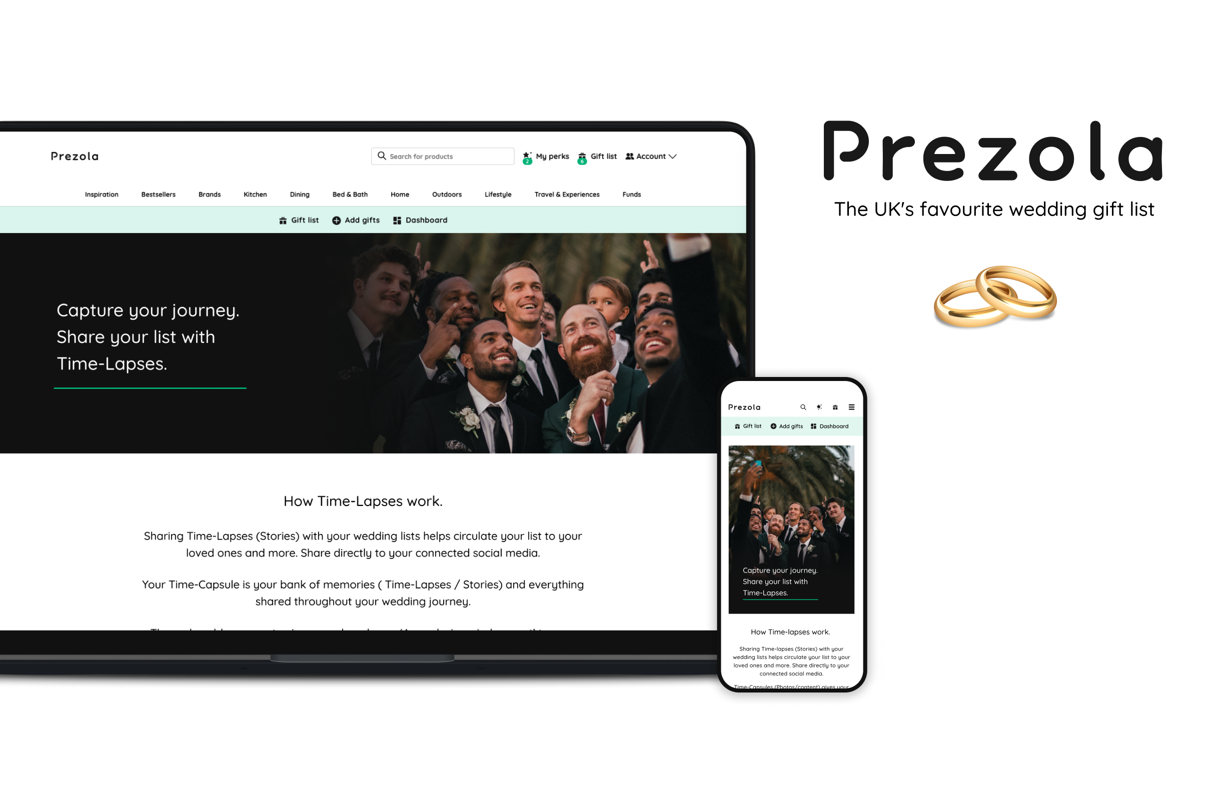
The redesign introduced two new engagement features — Time-Lapse Moments and Prezola Lens — transforming how couples create and share their lists. By combining emotional storytelling with social functionality, Prezola’s experience became more connected, accessible, and measurable.
Introduced new social-driven and in-store scanning experiences.
Strengthened emotional connection through narrative-led UX design.
Key Achievements
+35% projected increase in list sharing and engagement.
Improved accessibility and mobile performance scores.

THE PROCESS
I conducted a 5-day design sprint based on the design thinking methodology that includes 5 stages:
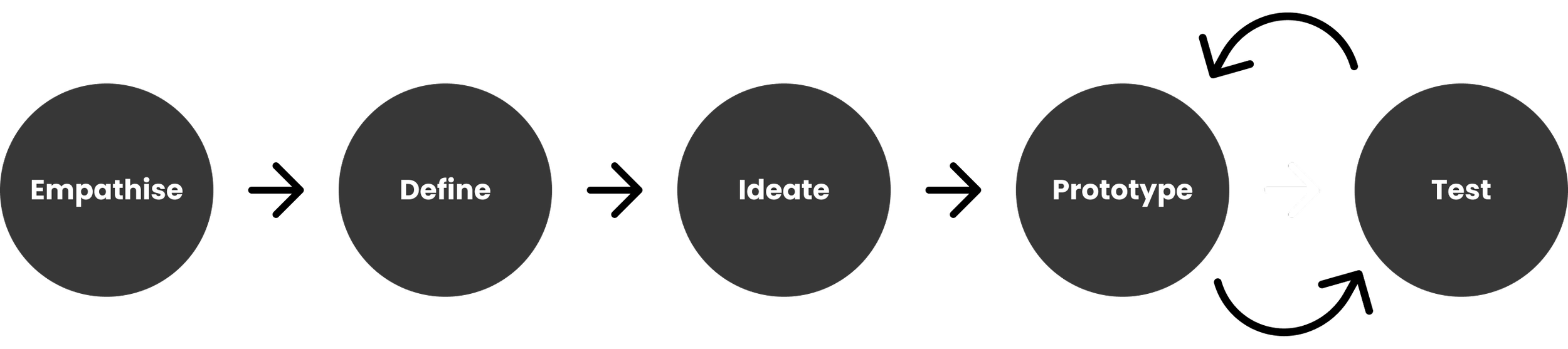
Empathise
II researched user behaviour, pain points, and competitor platforms to understand why couples weren’t engaging or sharing their lists. Insights revealed barriers in shareability, usability, and emotional connection..
Define
I framed these insights into key problems around engagement and social functionality. The focus became enhancing shareability, streamlining usability, and strengthening emotional storytelling throughout the experience.
Ideation
I brainstormed and sketched features like Time-Lapse Moments and Prezola Lens to help couples merge digital and physical experiences — from scanning gifts in-store to sharing milestones with guests..
Prototype & Test
I built rapid mobile and desktop prototypes to test the emotional and functional aspects of sharing and list-building. User feedback guided refinements to flow, clarity, and mobile performance..
RESEARCH
The research phase focused on understanding market trends, user motivations, and functional gaps across Prezola’s platform to guide the CX redesign.


Insight Overview
Underlying insights driving behaviours

1. Engagement
50% of users were not sharing their wedding lists, leading to low visibility and reduced conversions. Introduce emotionally driven features that make sharing personal, interactive, and rewarding.

3. Integration
Social sharing was underused, limiting reach beyond direct guests. Integrate Instagram and Facebook to simplify sharing and amplify organic growth.

6. Emotional Connection
Users saw Prezola as functional rather than inspiring.
Reframe the experience through storytelling features that celebrate milestones and shared memories.

2. Convenience
Couples wanted to blend in-person and online experiences when curating lists. Enable scanning real-world items directly into digital lists for greater flexibility.

4. Partnerships
Users valued meaningful, personalised gifts from independent retailers. Form partnerships with artisan brands to boost desirability and authenticity.

5. Mobile Optimisation
A significant portion of traffic came from mobile, yet the platform wasn’t fully responsive.
Prioritise mobile-first design to ensure frictionless browsing and list creation.
User Flow — Share, Scan & Celebrate
The user flow mapped the full journey from creating a list to sharing it socially. It identified key decision points and simplified the process across mobile and desktop.
The new experience enables couples to add, share, and celebrate in fewer steps — transforming passive browsing into active participation.
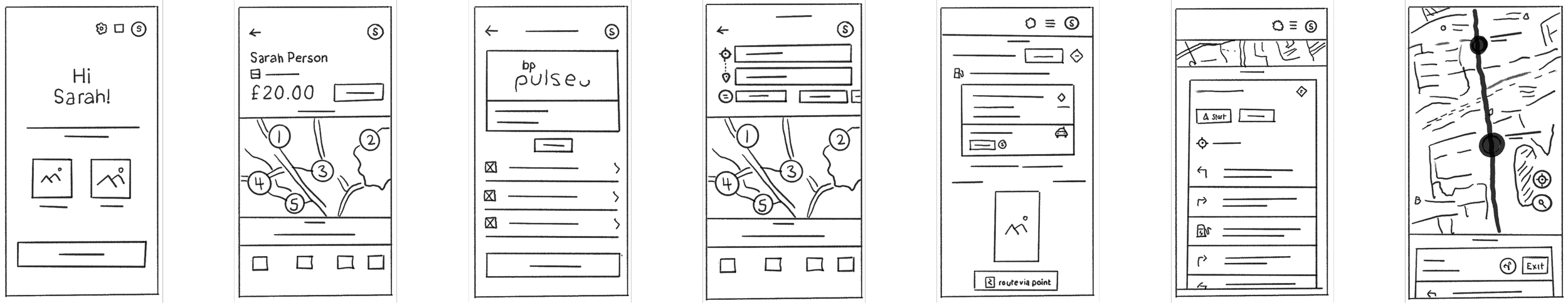
Sketches & Wireframing
Early sketches and low-fidelity wireframes were created to explore user flows, validate key features, and visualise the end-to-end charging journey before moving into high-fidelity design.

Testing wireframes and
iterating designs
I used unmoderated testing which allowed for multiple quick iterations throughout the feedback loop.- keeping the team / business within timescale and budget.
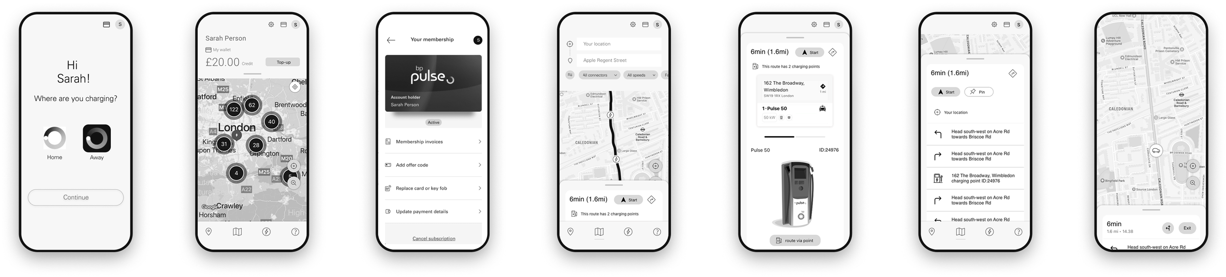
Evolving the Navigation Bar: User testing revealed that drivers prioritised quick access to maps and charging routes over account settings. By moving the profile icon to the top-right and replacing it with a map icon in the nav bar, the design aligned with real user needs—making charging faster, safer, and more intuitive.
Home & Away
Provides a unified interface for managing home and away charging needs, ensuring a consistent and personalised user experience

Taxi filters
Introduces a filter for professional drivers to locate designated stations and consumer users to identify charging points available to them, ensuring reliability and convenience.

Home Wallet
Enables quick access to wallet balances, top-up options, and transaction history directly from the top navigation bar.


Push Notifications
Delivers timely updates about nearby charging stations, available points, and account status, enhancing customer engagement.

Impact of features on BP Pulse’s user and operations
-
Increased User Satisfaction
85% of users reported greater satisfaction due to personalised route recommendations and the "Home and Away" feature simplifying their charging experience.
-
Enhanced Station Utilisation
Station efficiency improved by 30% due to predictive analytics optimizing charging schedules and reducing wait times.
-
Improved Revenue Generation
Push notifications increased station usage, leading to a 20% rise in daily transactions per station.
-
Professional Driver Engagement
Taxi-specific filters attracted 40% more professional drivers, creating a niche customer segment and increasing station revenue.
-
Reduced Operational Costs
Eco-energy optimisation decreased energy wastage, cutting overall costs by 25% while improving sustainability metrics.
-
Enhanced User Retention
Intuitive features and seamless user experience resulted in a 15% increase in repeat usage of BP Pulse charging services, strengthening customer loyalty.
Vivamus pellentesque vitae neque at vestibulum. Donec efficitur mollis dui vel pharetra.