

Global Relay Login CX:
Reimagining Mobile-First approach in a Unified Access Flow
CLIENT
Global Relay
Global Relay is a leading provider of archiving and compliance solutions for the financial industry, delivering secure SaaS platforms that help organisations manage communications data like emails and text messages. As part of their digital transformation, the company sought to unify and simplify its authentication system across services via a Global Login experience.
INFO
Team
Lead UX/UI Designer
Product Manager
Customer Relationship Manager
Engineers
Role
- Research & Insight - User Experience Design - User Interface Design
Dates
12 Weeks
OVERVIEW
Problem
Global Relay needed a unified login experience across its suite of financial compliance tools. But with multiple authentication methods (ID/password and SSO), users were unsure how to log in, often encountering friction, errors, or unclear redirects—especially on mobile.
Outcome
I redesigned the mobile login flow to simplify access, reduce ambiguity, and build user trust. Starting with a single login ID entry point, the system intelligently determines the right path (password vs. SSO) and communicates progress clearly through each step.
Key Achievements
45% increase in daily active users
THE PROCESS
5-day design sprint based on the methodology that includes 5 stages – However, due to this being a design task validation tests are incomplete.
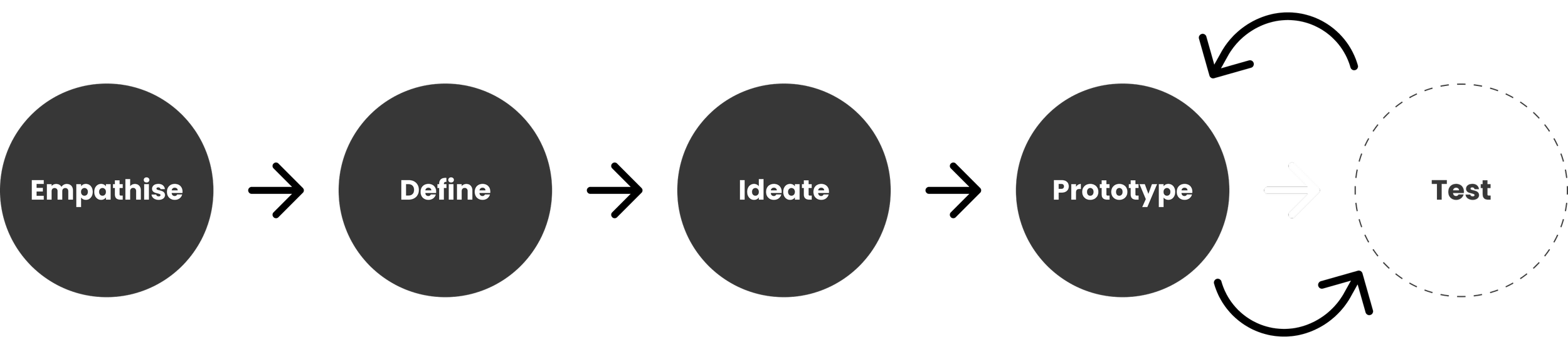
Empathise
I researched user frustrations with Global Relay’s login, including confusion between SSO and password, unclear logout behaviour, and frequent errors.
Define
I narrowed these down to core issues — lack of clarity, inconsistency across flows, and poor mobile ex — and set UX goals around simplicity, trust, and speed.
Ideation
Explored solutions like a single ID field, auto-detecting login type, and clearer error handling. Sketched flows and prioritised the most user-friendly.
Prototype & Test
Built wireframes and an interactive prototype. Simulated errors, slow internet, and SSO redirects to refine flow and copy, with usability testing planned.
PROBLEM SPACE
Balancing business goals with user needs, I identified pain points and focus areas to create a secure, simple, and consistent login experience.
Business Needs
Secure and Compliant Access
Meet security standards with SSO and MFA support for enterprise and
finance clients.
Unified Authentication Experience
Simplify login across all services with a consistent, single
sign-on flow.
Reduced Support Overhead
Minimise support queries with clear, user-friendly error handling.
User Needs
Clarity
Users need clear direction, especially during redirects.
Speed
Fast login expected—even on slow connections.
Trust
Users must feel their data is secure and handled professionally.
KEY CHALLENGES

SHAPING DESIGN APPROACH & PRIORITIES
These UX pillars served as my north star, guiding decisions to ensure security, clarity, and ease throughout the login experience.

IMPROVING THE UX FLOW
I mapped decisions, friction points, and recovery states to refine the login flow before wireframing, making it clearer, more secure, and easier for users to recover from errors.
WIREFRAMES
Low-fidelity wireframes exploring structure, flow, and error handling — focusing on clarity, guidance, and trust across all login scenarios.
UX MICROCOPY
Clear, human-friendly language was designed to guide users, reduce confusion, and provide reassurance across login, error, and progress states.

Global Relay’s unified login—featuring single ID entry, company-hosted sign-in, error handling, and streamlined dashboard access.
Testing Prototype (Live)

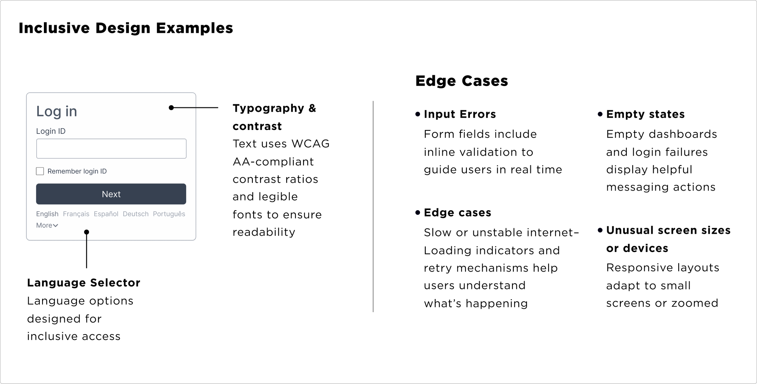
ACCESSIBILITY & EDGE CASES
Designing with inclusivity in mind, I planned for accessibility standards and accounted for real-world edge cases to ensure resilience across devices and contexts.
Hi-FIDELITY PROTOTYPES
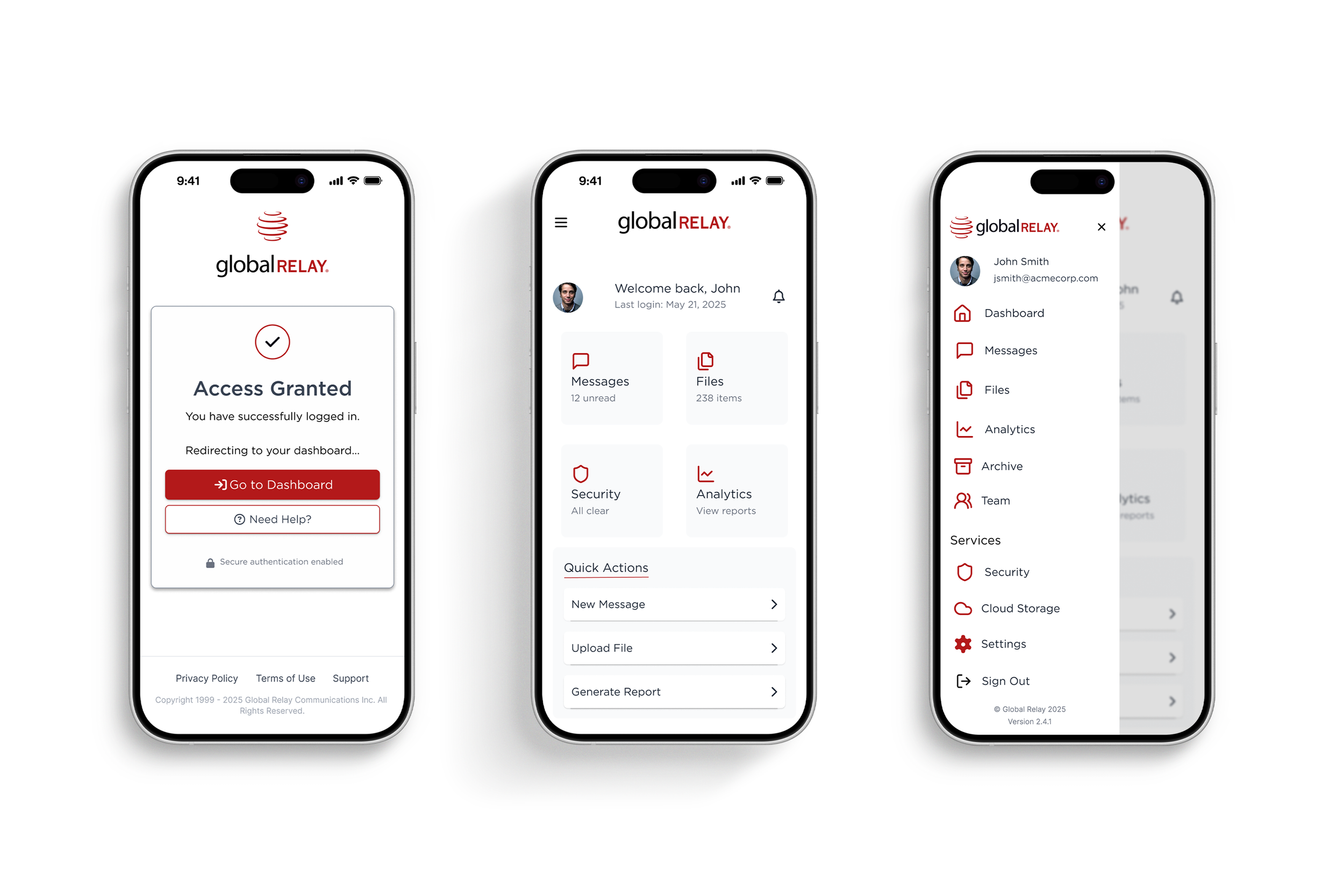
Simple Login/Access Granted
A frictionless experience from login to dashboard access, designed to build user confidence with straightforward actions and success confirmation.
Company Hosted Login (SSO Redirect)
Clear, supportive messaging guides users through the initial login process, with fallback options like Retry and Get Help in case of SSO issues.
Global Relay | Unified Dashboard
The Unified Dashboard gives users instant access to all Global Relay tools in one place — simplifying tasks with a clear, streamlined interface.
Validating further
-
Usability Testing & Validation
With more time/resources, I’d conduct moderated usability testing to validate the login flow—focusing on how users navigate the system, handle errors, and interact with accessibility features in real scenarios.
-
Data-Driven Iteration
Future iterations could benefit from real-time user data and analytics to refine error states and better support user recovery from friction points.
-
Progressive Login Features
I’d explore progressive onboarding, biometric authentication options (if applicable), and deeper personalisation of the login experience for global enterprise clients.
-
Scalability & Platform Expansion
To ensure consistency and security, I’d scale the solution across web, tablet, and dashboards with responsive layouts, session continuity, and accessibility compliance.